Posts

Showing posts from January, 2013

Symmetrical Furniture Arrangement

Image
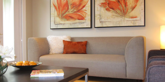
We cannot deny the importance of symmetry in nature; our faces are symmetrical and so are snowflakes. Our brains are hardwired to perceive symmetry as attractive. For this reason, in interior decorating symmetry plays a very important role. Certain rooms are better suited for a symmetrical arrangement than others. A wall with a fireplace or window in the center can be used to create a symmetrical arrangement. Most bedrooms work well with a symmetrical arrangement. The images below demonstrate how furniture laid out symmetrically can create cohesion and universal appeal.

Decorator's Color of Choice - White

Image
Have you ever wondered why most decorators chose to work with white when there are numerous other colors out there? Why not another neutral color? What about blue or green? Those are unobtrusive colors of nature too. Well, the answer lies in a simple fact. Every other color is in fact, obtrusive. White is clean, pure, dramatic and unobtrusive; rooms photograph well when all decked out in white. The same reason a bride wears white from head to toe. We all love white - universally and unanimously. We do not question its presence but get caught up in its unique ability to create a feeling of grandeur and openness; a feeling akin to no other than heaven itself. Most people may have a different favorite color but they all still love white for its inoffensive and clean presence. Home decorators understand this natural affinity for a clean, bright and open space; they layer white trim with white fabric and furniture. It is easier to introduce accent colors to a predominantly white background.

Orange as an Accent Color

Image
Recently, I saw a fashion blog claiming that orange is the new gray. I have always loved orange as an accent color for Staging homes. In home decor, orange works very well with gray and many shades of brown. This makes it a popular accent color. Orange is a bright, cheerful and dominating color and to use it appropriately in the right quantities is the key. It is important to keep in mind that if you use a large piece of art, an area rug or a chair in orange, you have to make sure to balance it all with a lot of other neutral furnishings. Orange in large quantities can be overbearing. I prefer it in smaller doses as purely an accent color. The market offers a large variety of decorating items in orange. This makes it easier to put a room together at a lower cost and in no time at all. See a few examples of using orange as an accent color below:

Decorating with Neutral Colors

Image
Many people feel that decorating with neutral colors is only for selling homes or for people who are color blind! It is most certainly a prerequisite for selling a home but it is not necessarily only for people with no interest in color. I am not sure if anyone else noticed but the sets and homes designed for magazines today clearly lean towards neutral decor. When Home Staging first became popular and homeowners selling homes saw the transformation of their homes to a luxurious neutral palette, a new trend was born. This is interesting because normally magazines would set the trends and the readers follow. This time around the population experienced a trend that they liked and the magazines catered to their changing taste.   My interest in decorating homes started roughly 25 years ago and I was always a huge fan of layering different textures and prints in, you guessed it, neutral colors! It was difficult to convince clients that a neutral palette will stand the test of time b